Saturday, February 9, 2019


Friday, January 12, 2018
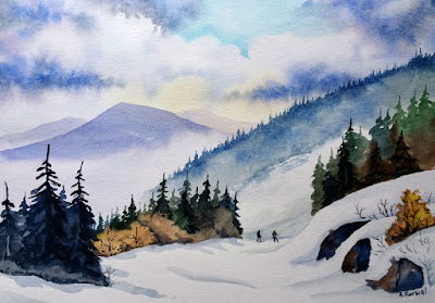
To glaze or not to glaze, this is the question.
Here is my watercolor picture of Winter Wonderland. If you
had an opportunity to visit Swallow Falls State Park
in Maryland

At a first glance the picture looked finished but after a
while I noticed that it was lacking the depth. Since Winter sceneries are
mostly white it is hard for us artists to emphasize shadows, and shadows add
the depth.
In such situation simple glazing can improve the picture. Glazing is a well-known watercolor technique that involves painting wet-over-dry picture. Because watercolor pigment,
even when dry, is not fixed to the paper, glazing needs to be done very gently.
To do so, I used a very soft and large brush. I loaded it with diluted paint. I
mixed previously used indigo and crimson red and started darkening the
background and carefully avoiding areas that needed to be white. Then I added
shadows to mid-ground snow covered trees. Finally I added an extra layer of
paint to the water at the bottom but left the waterfall foam and yellow
reflection untouched.

The idea of glazing can sound frightening because it involves painting
over a picture that is almost finished and full of details. But if glazing is
done properly it brings loose elements of the picture together and simplifies busy compositions.
So, to glaze
or not to glaze? Definitely glaze!
Sunday, December 3, 2017
How to find an art inspiration?
 Let’s say you have time, and you want to create some
art. Your studio is cleaned, your materials are well organized, and you have
desire to make something nice. There is nothing else to do but art.
Unfortunately, instead of submerging into the creative process, you realize
that you don’t know how to start. Something very important is missing. The inspiration.
Let’s say you have time, and you want to create some
art. Your studio is cleaned, your materials are well organized, and you have
desire to make something nice. There is nothing else to do but art.
Unfortunately, instead of submerging into the creative process, you realize
that you don’t know how to start. Something very important is missing. The inspiration.
They say
that you can find inspiration everywhere and this is true. So let's look for it.
First, leave
your studio because there is nothing interesting there. Walk away from your
computer, drawing from old photographs is not that thrilling. Real subjects are
much more inspiring.

 For me
though the best way to look for inspiration is outdoors. There, the
possibilities are endless. Your backyard, neighbor's doorway, old trees, rocks,
buildings, parks, rivers, lakes and mountains.
Everything is just waiting for you to discover it. Move around to find
the best angle for your composition.
Don't be attached to the first idea.
Draw several quick sketches and then choose the best one. Strive for
progress not for perfection. Take reference photos. You can finish your art
outside or bring it back to the studio. Notice how refreshed you feel by
stepping away and meeting with your art Muse.
For me
though the best way to look for inspiration is outdoors. There, the
possibilities are endless. Your backyard, neighbor's doorway, old trees, rocks,
buildings, parks, rivers, lakes and mountains.
Everything is just waiting for you to discover it. Move around to find
the best angle for your composition.
Don't be attached to the first idea.
Draw several quick sketches and then choose the best one. Strive for
progress not for perfection. Take reference photos. You can finish your art
outside or bring it back to the studio. Notice how refreshed you feel by
stepping away and meeting with your art Muse.
After such an experience you will soon be reworded with a beautiful drawing or painting. Pablo Picasso once said "Inspiration exists, but it has to find you working" so lets go for it.
Saturday, April 1, 2017
Willow

I was in Maryland's Zoo last week and I met newborn baby giraffe. Her name is Willow. She was born 7 weeks ago and she is the first baby giraffe at the facility in more than 20 years. I guess she will have a lot of visitors this spring and summer.
Willow, I wish you happy and healthy life :)
Willow, I wish you happy and healthy life :)
Thursday, March 23, 2017
Improving Daffodil Watercolor Painting


I decided to darken the background and make it richer. You can see that I sketched leaves and a flower bud at the top left corner. With such helpful pencil marks I was ready to start to paint around. I used in turns Phalo blue, yellow ochre and sap green colors.

When the paint dried off I added some more leaves with positive painting this time. I used deep green and darkened it with Phalo blue.
Next step - shadows.

Here is a
finished version. Darker shadows made this picture more three dimensional. To
create my gray for the shadow I used a mixture of Ultramarine blue and Burnt Umber. You can also use Paynes gray.
Friday, January 6, 2017
Warming up a ski run
I've just came back from a ski trip. I was skiing in a beautiful state of Vermont. The mountains were ready, perfectly covered with the white powder. It was a nice change from all that gray Maryland's scenery. Surprisingly there was not too many people there.

I began with making the sky more dramatic. I painted it with wet-in-wet technique. On the wet paper I threw yellow pale color just to add a little sunshine. Then I painted small part of the clear sky with cerulean blue. I carefully painted around white clouds. At the end I added darker tones to make heavier clouds. I used mixture of french ultramarine and crimson red.
Then I waited until everything dried out. After that, I painted the mountains starting with the farthest one. I used mixture of french ultramarine and crimson red.
The conifer trees were done with a combination of phthalo blue and yellow ocher. To create darker trees in the front I mixed french ultramarine and burnt umber. On my photograph, the trees are in all shades of gray. To change this and warm up the scene, I painted some bushes with yellow ocher and burnt sienna.
To emphasize skiers I painted them on a white background. I also narrowed the ski trail to eliminate the overwhelming whiteness of the snow in the foreground. Thanks to that, the skiers automatically became more pronounced. One of the skier's jacket had neon blue color. I found this tone too destructing so I changed it to the dark gray.
Now my dear readers it is your turn. You can take my photo and paint from it. Modify it to your taste and most of all enjoy the process. Start with quick pencil value sketch, it help to determine what you like. Let me know how it went :)

The views were spectacular and inspiring, especially from the mountain's summit. Although my sketchbook was in my bag all the time, I wasn't able to sketch. The wind was too cold to remove the gloves from my hands. Nevertheless I wouldn't be myself if I didn't take some photographs.
Here you can see one of my pictures. I took this one on the trail down the Ramshead Mountain. I knew right away that I would like the scene. Layers of mountains and small figures of skiers are great subjects for a watercolor painting.
Later at home I studied this picture in more detail. I noticed some drawbacks though. Heavy, gray clouds made this picture dull and almost monochromatic. Also the skiers were hardly visible on the dark background full of trees. I knew that I had to rearrange the composition of this picture a little.

I began with making the sky more dramatic. I painted it with wet-in-wet technique. On the wet paper I threw yellow pale color just to add a little sunshine. Then I painted small part of the clear sky with cerulean blue. I carefully painted around white clouds. At the end I added darker tones to make heavier clouds. I used mixture of french ultramarine and crimson red.
Then I waited until everything dried out. After that, I painted the mountains starting with the farthest one. I used mixture of french ultramarine and crimson red.
The conifer trees were done with a combination of phthalo blue and yellow ocher. To create darker trees in the front I mixed french ultramarine and burnt umber. On my photograph, the trees are in all shades of gray. To change this and warm up the scene, I painted some bushes with yellow ocher and burnt sienna.
To emphasize skiers I painted them on a white background. I also narrowed the ski trail to eliminate the overwhelming whiteness of the snow in the foreground. Thanks to that, the skiers automatically became more pronounced. One of the skier's jacket had neon blue color. I found this tone too destructing so I changed it to the dark gray.
Now my dear readers it is your turn. You can take my photo and paint from it. Modify it to your taste and most of all enjoy the process. Start with quick pencil value sketch, it help to determine what you like. Let me know how it went :)
Friday, December 23, 2016
This Chritmas
This Christmas I wish you all my friends and followers around the world
Peace and Happiness
and maybe Santa has left you a requested gift in your stocking.
Merry Christmas, Feliz Navidad, Wesołych Świąt
And a Happy New Year
:)
Peace and Happiness
and maybe Santa has left you a requested gift in your stocking.
Merry Christmas, Feliz Navidad, Wesołych Świąt
And a Happy New Year
:)

Subscribe to:
Posts (Atom)